Thread 'simple thing: better colouring for the statistics'
Message boards : BOINC Manager : simple thing: better colouring for the statistics
Message board moderation
| Author | Message |
|---|---|
|
Send message Joined: 5 Dec 12 Posts: 49 
|
Dear all, I would like to request what I think is a very easy thing for the next release of BOINC manager: To have the color of the statistics ordered in the way they are shown. I participate in many projects and sometimes I only want to see the evolution of some of them. As you can see in the image, is not infrequent that lines of the same color overlap making impossible to distinguish anything. In the picture, 2 reds, 2 black and 3 blue overlap. Would be possible to change the colors automatically depending of what lines are shown? I mean: if the color red is already used, don't use it again while other colors are available. Thanks! Yacob  ID: 60658 · |
|
Send message Joined: 5 Dec 12 Posts: 49
|
BTW, I am talking about BOINC 7.2.42 (x64) on Ubuntu Linux 14.04. Yacob ID: 60659 · |
 Jord JordSend message Joined: 29 Aug 05 Posts: 15973 
|
Already fixed in 7.4 ID: 60660 · |
|
Send message Joined: 5 Dec 12 Posts: 49
|
The last version available for Linux is 7.2.42. Besides, the 7.4 version for Windows is still suboptimal, in my opinion. With this "rainbow" schema, when you have many projects, colors are too similar. Again the same problem. Take a look at the picture.  ID: 60669 · |
|
Jord Send message Joined: 29 Aug 05 Posts: 15973
|
With this "rainbow" schema, when you have many projects, colors are too similar. That's the thing with lots of projects, there are only a limited number of true colours before they start looking like each other. The colourscheme used is the same as in the Disk tab. Unless you know of an easier method to distinguish between different problems and still allow for future expansion of the colours used, I'm sure the developers will want to know. ID: 60673 · |
|
Send message Joined: 23 Apr 07 Posts: 1112 
|
The last version available for Linux is 7.2.42. That's not true, Berkeley has Boinc 7.4.22 available for download: http://boinc.berkeley.edu/download_all.php Debian has 7.4.23 available for wheezy-backports, Jessie, sid and experimental: https://packages.debian.org/source/wheezy-backports/boinc Ubuntu has 7.4.8 for The Utopic Unicorn, and 7.4.23 for The Vivid Vervet: https://launchpad.net/ubuntu/+source/boinc And if you add locutusofborg's ppa to Ubuntu trusty, utopic or vivid then you can have Boinc 7.4.41: https://launchpad.net/~costamagnagianfranco/+archive/ubuntu/locutusofborg-ppa Updating the regular distro Boinc package is up to that Distro(depends what their policy is)/their package maintainers. Claggy ID: 60674 · |
|
Send message Joined: 5 Dec 12 Posts: 49
|
The last version available for Linux is 7.2.42. I meant the last stable version. Unless you know of an easier method to distinguish between different problems and still allow for future expansion of the colours used, I'm sure the developers will want to know. Yes, I could imagine one: show only colors for the projects that you have selected and change them as long as you show/hide more projects. e.g.: make a unique list of colors from the most different ones to the most similar ones: 1. red 2. blue 3. green 4. yellow 5. purple 6. orange 7. pink 8. cyan etc Now, show the projects in that order. If I have 4 projects, A, B, C, D, and I want to see only B and D, B should be red and D blue. If I want to see the projects A, C and D, A should be red, C blue and D green. I think is one of the simplest way to minimize the possibilities of making lines to have too similar colors. Independently of what you are showing. The disk tab should not have to follow the same profile, because I am not able to compare both tabs at the same time. For the user, there is no point in being the same colors. If you want to go even further: consider the "average work done" on the monthly interval (stats show only one month) as a factor. The most similar should have the most different colors. And again, remake the graph every time I change the projects to show. Am I explaining it correctly? However, I am just a user. THEY should see what is the best ;) I am just realizing of a behaviour of the program that is suboptimal. ID: 60675 · |
|
Send message Joined: 5 Dec 12 Posts: 49
|
...consider the "average work done" if you are showing the "user average" or the "host average" of course. Consider the "total work done" if you are showing the "user total" or the "host total". ID: 60676 · |
|
Jord Send message Joined: 29 Aug 05 Posts: 15973
|
make a unique list of colors from the most different ones to the most similar ones. That's 16 colours, including white and black before we repeat to similar style colours. 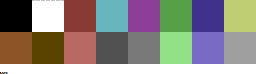 What to do when you have 50+ projects added? ID: 60678 · |
|
Send message Joined: 5 Dec 12 Posts: 49
|
Jord, I am just saying how to assign the color. What order to follow. Not the number of colors. make a unique list of colors from the most different ones to the most similar ones. Use 256 colors for that list or 65536 if you like. ID: 60685 · |
|
Richie Send message Joined: 2 Jul 14 Posts: 186 
|
I think "All projects together" is a wrong choice in the beginning if you have more than ten individual things to display at once in a graph. It is a known fact that much less than ten is the amount of "things" that a human can compare and understand in a graph. After that it just becomes a fuzz with exponentially less useful meaning. No matter what colours the lines might have. ID: 60689 · |
|
Jord Send message Joined: 29 Aug 05 Posts: 15973
|
Use 256 colors for that list or 65536 if you like. And I pointed out that after 16 colors, there are no unique colors anymore. Especially if you go the road of 65,536. At the moment, what's available to use is 256 hues of red, 256 hues of green and 256 of blue, but each project gets its own unique color appointed that is then used in both the Disk and Statistics tabs. ID: 60694 · |
|
Send message Joined: 23 Feb 12 Posts: 198
|
Use 256 colors for that list or 65536 if you like. And what he is saying is that we can de-select which projects are on the graph until he gets down to just the hand full that he wants to compare. When you do this those colors could be adjusted accordingly. Why should WCG stay Green shade number 189? If you only select 8 projects of the 100 you have attached, why can't the colors adjust to those core16 (or less)? 
ID: 61138 · |
|
Send message Joined: 23 Feb 12 Posts: 198
|
I think "All projects together" is a wrong choice in the beginning if you have more than ten individual things to display at once in a graph. It is a known fact that much less than ten is the amount of "things" that a human can compare and understand in a graph. After that it just becomes a fuzz with exponentially less useful meaning. No matter what colours the lines might have. I think that not all screen sizes are adequate to have 10 different graphs listed when one could suffice even better.
ID: 61139 · |
|
Crashguard303 Send message Joined: 25 Apr 08 Posts: 21 
|
Maybe it would just help, if the circles and triangles at the edges were bigger. Or two-colored lines (hatching / shading). Or a different line-shaping ("stamping" triangles, circles or boxes, called "brushes" in graphics software). Apart from changing the line colours, how about this: If you move the mouse cursor over a line, the corresponding project name is highlighted in the list on the right and / or a tooltip shows the project's name ("data row"'s name). The tooltip could also show x- (time) and y-values (score). MS-Excel does this when using diagrams / charts. ID: 61482 · |
|
Crashguard303 Send message Joined: 25 Apr 08 Posts: 21
|
...and vice versa: If you move over a project in the list on the right, the project's line is highlighted in the graph. ID: 61573 · |
|
Send message Joined: 5 Dec 12 Posts: 49
|
And what he is saying is that we can de-select which projects are on the graph until he gets down to just the hand full that he wants to compare. When you do this those colors could be adjusted accordingly. Why should WCG stay Green shade number 189? If you only select 8 projects of the 100 you have attached, why can't the colors adjust to those core16 (or less)? Thanks, Coleslaw. Thanks for the suggestions, Crashguard303. Yacob ID: 61618 · |
|
Crashguard303 Send message Joined: 25 Apr 08 Posts: 21
|
And what he is saying is that we can de-select which projects are on the graph until he gets down to just the hand full that he wants to compare. When you do this those colors could be adjusted accordingly. Why should WCG stay Green shade number 189? If you only select 8 projects of the 100 you have attached, why can't the colors adjust to those core16 (or less)? Yes, also a good idea. You're welcome. ID: 61631 · |
|
Crashguard303 Send message Joined: 25 Apr 08 Posts: 21
|
make a unique list of colors from the most different ones to the most similar ones. Had a feeling, now I've seen the link. The C64 palette ;) What to do when you have 50+ projects added? Yes, that's a point. I personally don't have this much, but: 1. How about user-definable color schemes/palettes? So, nobody else could be blamed for "wrong colors". 2. These user-defined palettes could initially be generated with some nested triangle-functions, working with RGB or HSV / HSL (I prefer HSL, hue-saturation-lightness). Users could use a slider to set positive H stepsize (and maybe negative L stepsize). The key: you could use a bigger stepsize than it's used at the moment. As far as I've got it, H-stepsize at the moment is this small, that you start with red and end with violet. The current chart uses a kind of: 'let n be the number of projects
'and i the palette color index (0 to n-1)
'and H the hue value array, elements indexed with i, values from 0 to 255, meaning red to violet
for i = 0 to n-1
{
H[i] = i * 255/(n+1)
}If H-stepsize would be bigger, there will be more than 1 rainbow in the project's list with hues which are not this "close together": let tri(x) = x mod 256 'triangle function
H[0] = 0 'start hue at red
for i = 1 to n-1
{
H[i+1] = tri(H[i] + 255/(n+1) + user_defined)
}Or even: H[0] = user_defined1 'start hue at specific color
for i = 1 to n-1
{
H[i+1] = tri(H[i] + user_defined2)
}user_defined2 should work good with odd values (even better: prime numbers). Or some RGB-mixing: 'let R,G and B be color intensity arrays, elements indexed with i, values from 0 to 255, meaning black to full
for i = 1 to n-1
{
R[i] = tri(i * user_definedR)
G[i] = tri(i * user_definedG)
B[i] = tri(i * user_definedB)
}Works good if each user_definedX is different (or even prime) ID: 61632 · |
|
Crashguard303 Send message Joined: 25 Apr 08 Posts: 21
|
Sorry, I couldn't modify the text anymore. The end has to be like this: The current chart uses a kind of: 'let n be the number of projects
'and i the palette color index (0 to n-1)
'and H the hue value array, elements indexed with i, values from 0 (red) to 255 (violet, almost red again)
for i = 0 to n-1
{
H[i] = i * 256/n
}If H-stepsize would be bigger, there will be more than 1 rainbow in the project's list with hues which are not this "close together": let tri(x) = x mod 256 'triangle function
H[0] = 0 'start hue at red
for i = 1 to n-1
{
H[i] = tri(H[i-1] + 256/n + user_defined) 'user_defined works as "spread tweaker", 0 leaves "colour spread" as it is.
}This code snippet could be more compact (just a loop from 0 to n-1, using a different formula).But this way it can be compared better with this one: H[0] = user_defined1 'start hue at specific color
for i = 1 to n-1
{
H[i] = tri(H[i-1] + user_defined2)
}user_defined2 should work good with odd values (even better: prime numbers).Or some RGB-mixing: 'let R,G and B be color intensity arrays, elements indexed with i, values from 0 to 255, meaning black to full
for i = 0 to n-1
{
R[i] = tri(i * user_definedR)
G[i] = tri(i * user_definedG)
B[i] = tri(i * user_definedB)
}Works good if each user_definedX is different (or even prime)ID: 61644 · |
Copyright © 2026 University of California.
Permission is granted to copy, distribute and/or modify this document
under the terms of the GNU Free Documentation License,
Version 1.2 or any later version published by the Free Software Foundation.